What shapes do you associate with logos? A triangle, a square, a circle, or maybe even an oval. But what about the shape of your logo? Does it matter to you if your logo is circular or rectangular? Do you want something that stands out from the crowd and gives off an eye-catching vibe? The answer to these questions may depend on what industry you are in. For example, if your business sells clothing then it would probably be best for your logo to have curves because people associate straight lines with suits and ties. This blog post will discuss how different shapes represent certain ideals and give insight into which one might work best for your company!
Soft, round, organic shapes
Soft, round, organic shapes give off a feeling of comfort and coziness. They are often associated with feelings like love, nurturing, and warmth. This shape is usually used in logos that represent food brands or anything else where people want to be relaxed and comfortable.
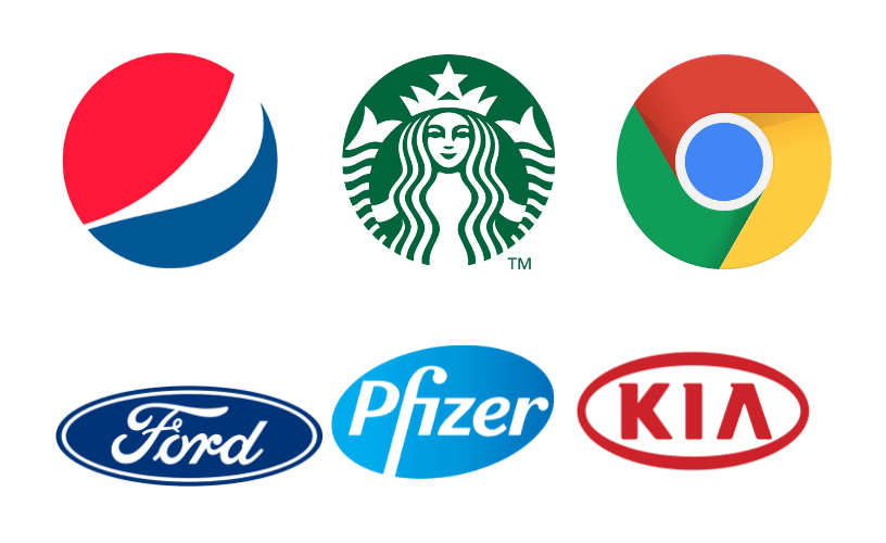
1) Circular, elliptical and ovoid logos
The above described shapes are the most common ones that you will see in logo design but there is actually a whole range of different symbols and images that can be used to represent businesses. One final style worth mentioning here would be for ovoid logos which, as one might imagine, has an oval shape. In this case though it's not just about being fancy or expensive - instead these types of companies prefer to use them because they want their image to appear friendly and approachable.
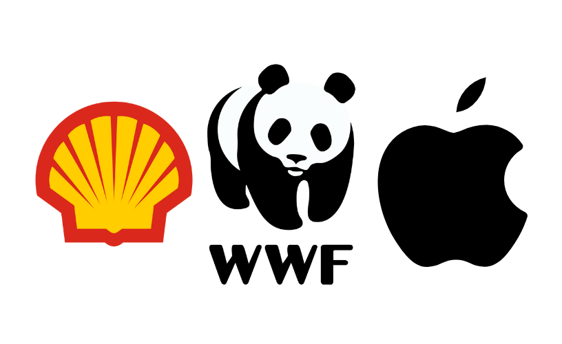
2) Organically Shaped Logos
Another very common choice is to get away from the traditional square, circle and oval shapes. Instead a company may choose something more organic which might include leaves or ivy leaves; branches of trees; twigs (or even roots); petals in particular flower designs like lilies and daisies or other plants. In some cases companies will pick symbols which represent the type of company they are such as a cutting tool for an engineering firm or oil paintbrush in relation to an art gallery. In general though these logos tend to be less commonly used than those with more traditional shapes and symbolism that we discussed above because they can be harder to make out unless someone is quite familiar with them already.
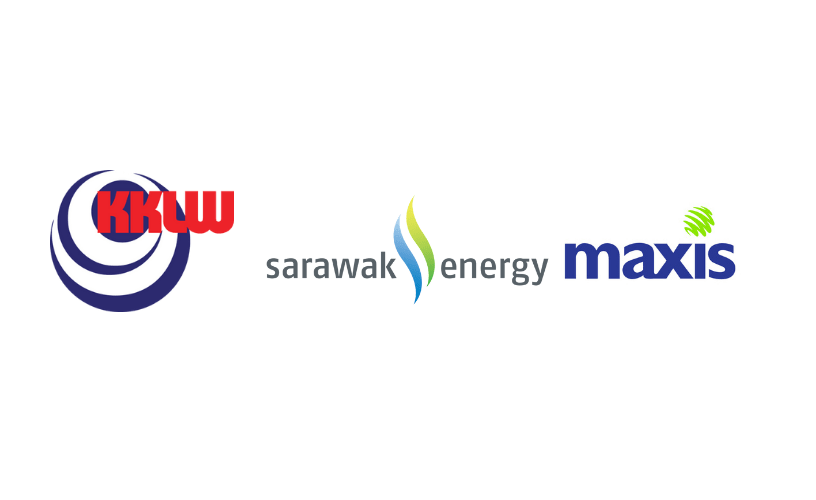
3) Spirals, Swirls, and Dots
Some logo shapes are less common than others but still make a nice addition to your design. Spirals can look great in the right circumstances like as part of nature or something creative such as an artistic company where they might want to use it. Swirls work well for things which already have circular designs like a bubbling cup of coffee or hot chocolate. Dots are great for adding to other shapes like spirals and swirls but can also be used on their own too such as in the shape of an eye which is commonly seen in logos.
Sharp and angular shapes
Sharp, angular logos are going to be used by companies that want their image to appear powerful. There is no doubt about it - these types of symbols and images will make people think twice before crossing them or taking advantage of them in any way because they know just how dangerous this company can be if things don't go the right way for them. The sharpness and angles also represent speed so you'll see a lot of racing related brands use similar shapes as well as those within the technology sector who want their products (and themselves) to seem cutting edge and advanced.
1) Square and Triangle Logos
When you see a square or triangle logo, it is usually to signify balance. These shapes are seen as stable and reliable so they're perfect for banks and financial institutions who want their customers to feel safe knowing that they can rely on them at all times. It's also great for insurance companies which again, want people to trust them with something as precious as their home or car. When these logos appear in front of healthcare related brands, the symbolism gets even deeper because typically triangles represent good health while squares suggest stability - both things that this industry wants more than anything else!
2) Logos Containing Vertical Lines
Vertical lines are usually associated with strength and stability. This makes them perfect for the construction industry which is all about building strong, reliable structures that are meant to last a long time! Logos such as these come in especially handy when brands want to make an impactful statement because they're able to do it while keeping things simple at the same time making their logo really easy to recognize.
3) Logos Containing Horizontal Lines
In contrast, logos that contain horizontal lines are usually associated with stability and peace of mind which is why they're so common in the world of finance where reliability is a top priority! Logos such as these are perfect for companies who want their logo to communicate trustworthiness and patience while also being easy to recognize.
Cultural Logo Shapes
Logos containing hearts and ribbons are often related to weddings, love, relationships as well as pharmaceutical companies while logos that contain crosses usually relate to religion and Christianity.
Conclusion
A logo shape should be selected based on the audience, industry and location of a company. For example, symbols such as crosses are more common in churches while triangles may relate to technology companies or health care services which require moving forward with innovative ideas.