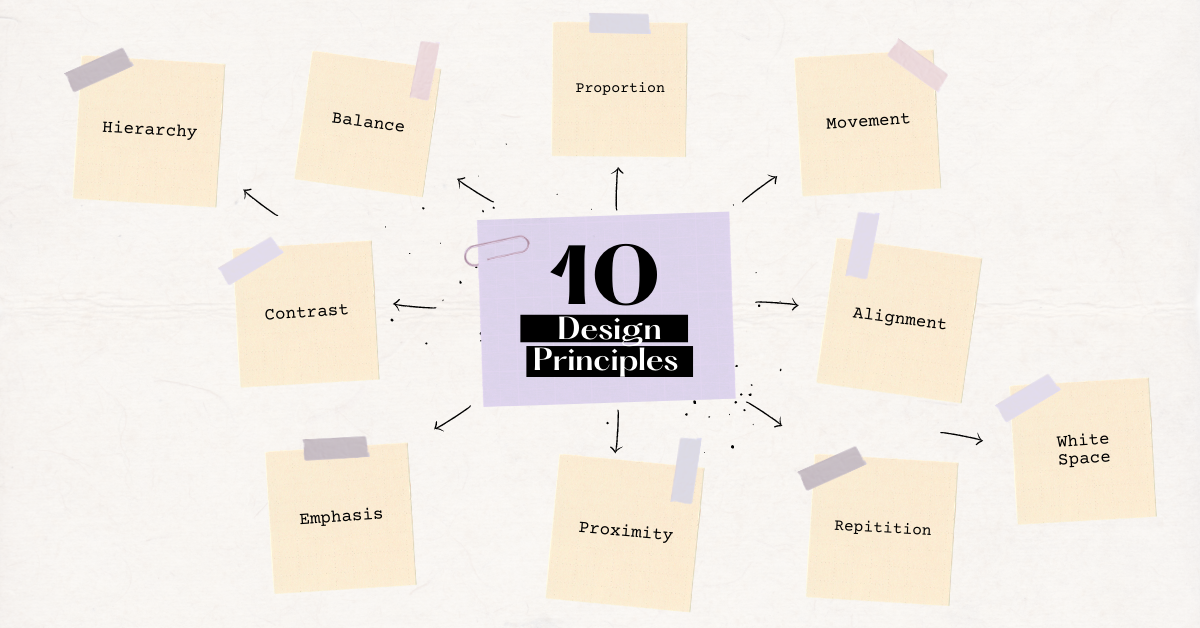
Design is all around us. It’s in the clothes we wear, the way our homes are decorated, and the products we use every day. Good design is important because it makes our lives easier and more enjoyable. As a designer, it’s important to understand the basics of good design so that you can create beautiful and user-friendly designs that people will love. In this blog post, we will discuss 10 essential design principles that every designer should know!
1. Balance
In design, balance is the distribution of visual weight within a composition. When elements are evenly balanced, they create a sense of stability and calm. There are two types of balance in design: symmetrical and asymmetrical. Symmetrical balance is when elements are arranged in an orderly fashion on either side of a central axis. Asymmetrical balance is when elements are arranged in a more random or chaotic way.
2. Contrast
Contrast is the difference between two elements in a composition. It can be used to create visual interest, hierarchy, and depth. The use of contrasting colors can help to emphasize the differences between elements, while the use of light and dark tones can add depth and create a sense of movement. Good contrast makes it easy for users to see and understand your design.
3. Emphasis
Emphasis is the act of making one element stand out from the rest. It can be used to draw attention to important information or to create a focal point in a design. When using emphasis, be sure not to overdo it. Too much emphasis can make a design look busy and cluttered.
4. Proximity
Proximity is the relationship between elements that are close to each other. It can be used to create grouping and hierarchy. Grouping similar elements together makes it easier for users to see the relationships between them.
5. Repetition
Repetition is the use of repeated elements in a design. It helps to create consistency, balance, rhythm, and structure. It can be used to create rhythm and unity. Repeating elements helps users to see the relationships between them and makes a design feel cohesive.
6. Alignment
Alignment is the act of aligning elements in a composition. It increases the readability and usability of a design, as it helps all elements of the design, such as text, images, and elements, to be visually connected and cohesive. When elements are aligned, they appear to be connected, which makes a design feel unified.
7. Proportion
Proportion is the relationship between the size of elements in a composition. It can be used to create visual interest and hierarchy. It is the relationship between the parts of a design and the whole. A good design should use proportion to create a pleasing and harmonious composition. When elements are proportionate, they appear to be balanced and stable.
8. Movement
Movement is the act of creating a sense of motion in a design. It can be used to guide users through a composition and to create visual interest. Movement can be created using animation, transitions, and scrolling.
9. White space
White space is the empty space in a composition. It can be used to create visual interest, hierarchy, and depth. White space helps to break up a design and makes it easier to read and understand. It can be used to add visual interest and provide a sense of direction. By using white space strategically, designers can help to create a look and feel that is pleasing to the eye.
10. Hierarchy
Hierarchy is the act of creating a system of organization in a composition. It can be used to create visual interest, emphasis, and movement. Hierarchy helps users to see the relationships between elements and to understand the importance of each element.
Conclusion
Design principles are essential knowledge for any professional designer. These 10 design principles provide the necessary foundation for any designer to understand the fundamentals of design in a meaningful way. When designing, it’s important to keep these principles in mind in order to create beautiful, user-friendly designs that people will love! Thanks for reading! 🙂 Visit Artmeet for more reads like this.

