Design and the entire field of art are highly subjective endeavours. The majority of artists and reviewers still concur with the ancient adage that “beauty is in the eye of the beholder.” We talk about the golden ratio in design in this article. You cannot always be certain that your work will be well-received; a particular design that is seen to be awe-inspiring by some may be considered as dull or lacking by others.
Graphic designers may employ a few methods and suggestions to help with their creative processes, though. The Rule of Thirds, which divides images into three equal portions to maximise their visual harmony, may already be familiar to you.
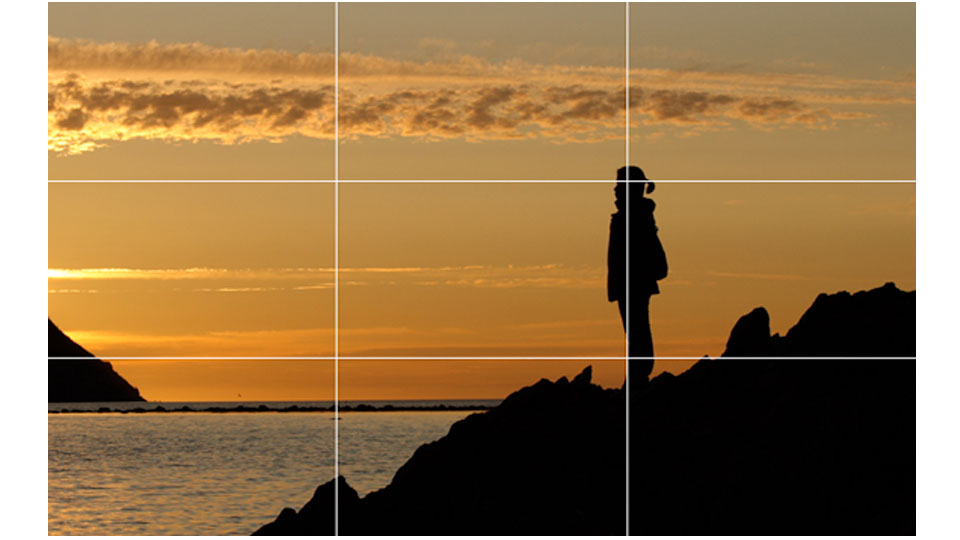
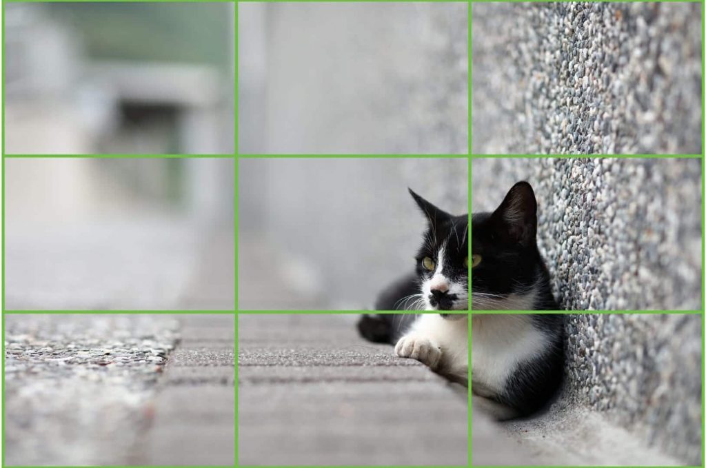
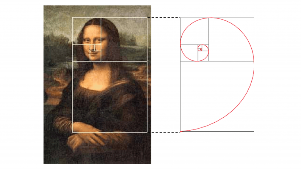
The Golden Ratio, a scientifically validated indicator of beauty that has been employed by people like the great artist Leonardo da Vinci, is another crucial rule. Have you ever pondered the factors that contributed to the Mona Lisa’s fame and success as a piece of art? The utilisation of the Golden Ratio in da Vinci’s works of art holds the key to the solution. This ratio is a decimal number that is also referred to as the Golden Ratio, the Golden Section, or the Greek letter phi. It helps you to produce flawlessly balanced and proportioned designs that are extremely psychologically appealing.
It’s true that creativity and creative expression should be the main driving forces behind art and design. But adding the Golden Ratio to these factors adds a mathematical component to the mix. The end effect is a change in your capacity to produce attractive, flawlessly proportioned graphics that subtly appeal to your audience.
Here’s how it works.
The Theory Behind The Golden Ratio
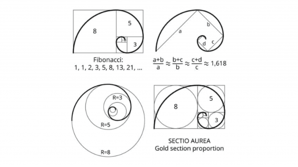
The Golden Ratio is 1.618, to put it simply. When two numbers are split in a way that makes their ratio match the ratio of their total to the greater of the two numbers, this ratio is utilised. The Fibonacci Sequence may be used to describe the ratio in the most straightforward manner. The numbers in this progression are added together, going from 0 to 1, 1, 2, 3, 5, 8, 13, 21, and so on.
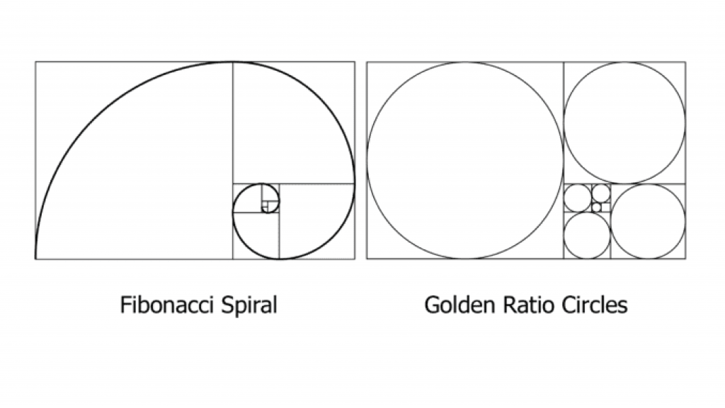
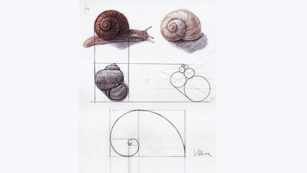
The Fibonacci Sequence was employed by the ancient Greeks to provide a visual blueprint that benefited their creations. It is hardly surprising that they are still regarded as the greatest artists, sculptors, and designers of all time. When the sequence is cut into squares and arranged to create concentric rectangles, a “Golden Spiral” that expands exponentially appears. It’s not necessary to be intimidated by these technical and mathematical jargon. The Golden Ratio is much easier than it first looks and is prevalent in nature. This number determines the shapes of seashells, galaxies, honeycombs, flowers, storms, and creatures, which accounts for their amazing aesthetic beauty.
Putting the Golden Ratio Into Practice
The Golden Ratio provides a straightforward number that you may utilise in graphic design to organise the otherwise creative and impromptu nature of design. It may be used to calculate the size of another element by multiplying the size of any element by 1.618. Some designers use it to gauge how much white or empty space should be present in a design to avoid making it appear too harsh or crowded.
You may also utilise the ratio to build your fundamental layouts, graphics, and typography, or you could use the Golden Spiral as an overlay to change the positioning of an element.
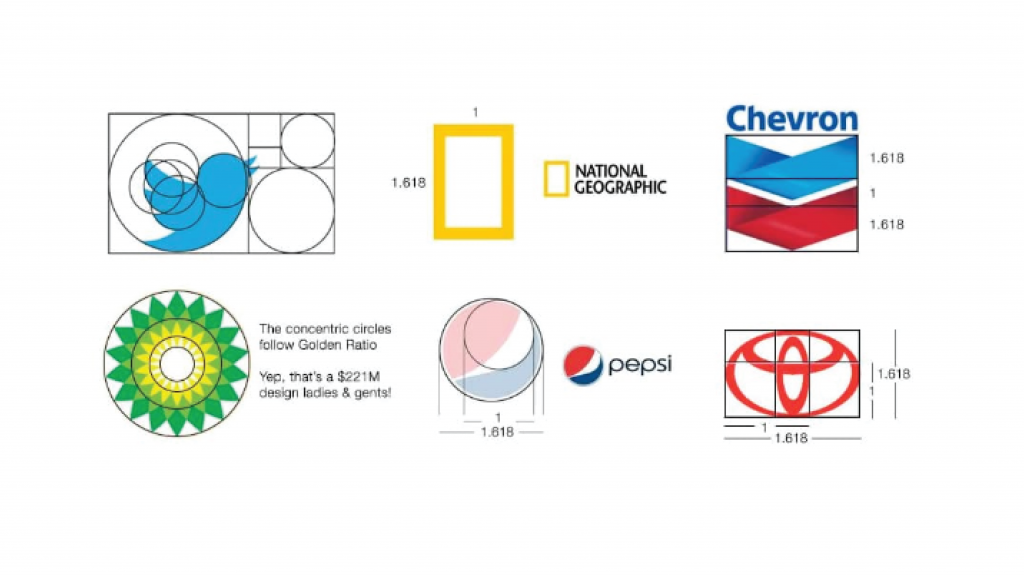
Here are some helpful hints for using the Golden Ratio to hone your art and add a touch of scientific beauty to your graphic designs.
- Put it to use in your typographic design. Consider including a messaging hierarchy within your layout if your design will contain text. You don’t need to make any educated guesses about the size of your typography if you use this ratio as a guide. Posters, websites, and invitations all call for different text sizes.
Let’s imagine you want to establish the order of significance for your content (X), text of medium relevance (Y), and unimportant text (Z) (Z). You may multiply 12 by 1.618 to get a reference for your higher text sizes if you decide to choose 12px as your least font size.
- Utilize it to help you compose your images. There may be moments when you need to take a step back and reevaluate your work, but the pictures in your designs should always be aesthetically harmonious. The Golden Spiral can still be used as a guide even if you don’t have the time to complete this. To determine which pieces should go where and whether they are genuinely as harmonious as they may appear to the unaided eye, overlay the spiral onto your photographs.
The spiral may be used to help you decide where your design’s key points should be, where to place headings and text, and which pieces need to be adjusted.
- Use it to create logos. Every firm’s brand image depends on a well-designed logo, and any logos you create should quickly and clearly communicate the essence of a company. The Golden Ratio may be used in your logo design to attract potential customers right away and help them relate to your business. It’s interesting to note that several of the most popular businesses in the world, like National Geographic, Google, Apple, Pepsi, and Twitter, have included the ratio into their logo designs.
You might consider the Fibonacci sequence as a grid to utilise as the base of your creativity while creating an effective logo, or you can use the Golden Spiral as an overlay.
- Use it while creating work layouts. Design layouts may often become complex, especially if you need to integrate a variety of various components. Fortunately, you can effortlessly position and direct each important component by using the Golden Spiral. We advise placing your most crucial message or component in the spiral’s centre because the human eye is naturally pulled there.
- Utilize it while you are wire-framing. You may plan a structure and accurately size the various elements of its user interface by using the ratio during wire-framing. Additionally, it allows for the cropping of photographs without stretching or distracting visual distortion.
How to Create a Golden Rectangle
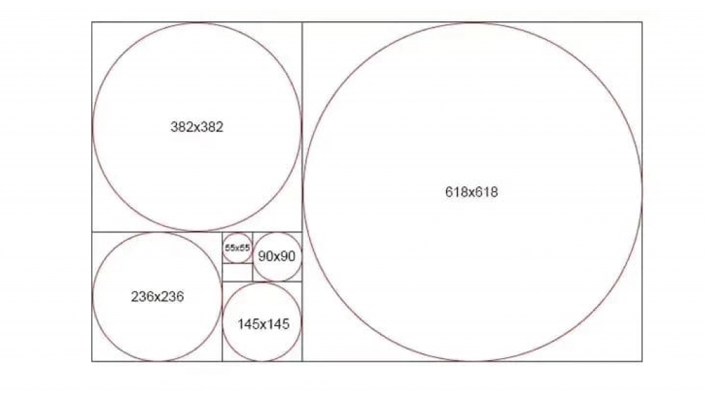
You can make a Golden Rectangle if utilising the Golden Spiral as an overlay is not appropriate for your requirements. This rectangle satisfies the requirements set out by the ratio. It could be more helpful to your design process the more you split it by the Golden Ratio. To begin, draw a straightforward rectangle with ‘golden’ proportions. For instance, if it is 1000 pixels wide, you may calculate its height as 618 pixels by multiplying that amount by 1.618. Next, add a 382×618-inch rectangle to the left of your canvas and a 618×618-inch square to the right. You’ll still have a Golden Rectangle. Create a square within this new rectangle, and you’ll have produced another one in the empty area. You may repeatedly split your canvas in this manner. Keep an eye out for how the longest dividing line creates a prized Golden Spiral each time you split your rectangle.
The Golden Ratio in Other Shapes
The easiest and most practical approach to visualise 1.618 is using a golden rectangle. However, if you’d want, you may also use the ratio with triangles, circles, and other forms.
Concentric circles, for instance, can be used to make a form that is extremely similar to the perfect spiral. Those circles would form a design like a snail’s shell and would fit perfectly inside a string of Golden Rectangles. An isosceles triangle with two equal sides and a third side that is in golden ratio to the other two can also be used to make golden triangles. This creates another Golden Spiral form that can serve as a design cue after these triangles are nested inside of one another using phi as a size reference.
The Bottom Line
When you add 1.618 into your design process, it can well wind up becoming your new best buddy. The Golden Ratio may influence your work in a variety of ways, enhance the aesthetic harmony of your products, and draw the attention of your intended audience. To get the ideal proportions for your design, you may easily utilise the Golden Spiral as a helpful overlay to direct your work or multiply text and image sizes by the ratio.
There are several desktop and mobile apps that offer personalised Golden Ratio overlays and options to assist you in perfecting your artwork. Among the various alternatives available, GoldenRATIO, Phicalculator, Atrise Golden Section, and PhiMatrix are just a few.
Many of the most well-known artists and designers in the world have included the ratio into their acclaimed works because of its universality and scientific character. You may now, too. Obviously, art is not a science in and of itself, but combining the two may lead to some pretty amazing outcomes that your customers and viewers will like!
Join The Logo Community
We hope this has helped you in How To Use the Golden Ratio In Graphic Design. If you would like more personal tips, advice, insights, and access to our community threads and other goodies, join Artmeet in our community. Learn from our community.

