Tk's Design #3
Description
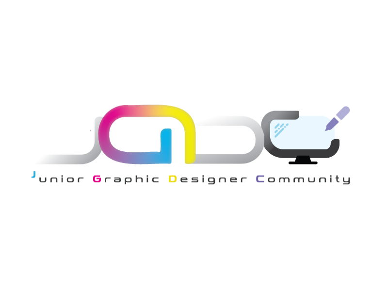
The logo is inspired by futurism and typography. Futuristic typeface is chosen to symbolize we younger graphic designers are on the front line of modern generations. The letter G is purposely rotated & coloured in different way compared to the letters, which represents we graphic designers are unique and the most stand out among the ordinary people (colored in grey), in terms of mindset, skills, knowledges etc, each first letter from the sentence below colored in a similar way also used for representation above. The G is abstract from the term ‘Graphic Designers’, which is obvious for its representation. The letter G is colored in a palette similar to CMYK color palette, a common print material color mode. The letter C is design to resemble a desktop with a pen beside, symbolize our professions.
Description
The logo is inspired by futurism and typography. Futuristic typeface is chosen to symbolize we younger graphic designers are on the front line of modern generations. The letter G is purposely rotated & coloured in different way compared to the letters, which represents we graphic designers are unique and the most stand out among the ordinary people (colored in grey), in terms of mindset, skills, knowledges etc, each first letter from the sentence below colored in a similar way also used for representation above. The G is abstract from the term ‘Graphic Designers’, which is obvious for its representation. The letter G is colored in a palette similar to CMYK color palette, a common print material color mode. The letter C is design to resemble a desktop with a pen beside, symbolize our professions.
Comments (0)
No more comments found
No more comments found