Diana's Combination Mark Logo Design #1
Description
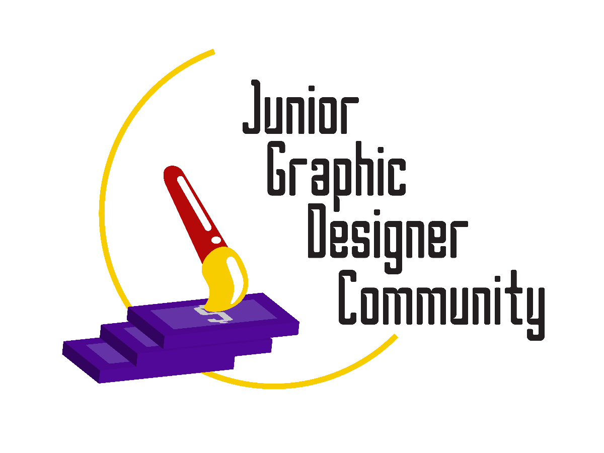
The overall design of the combination mark logo is to bring out the main objectives of JGDC as well as its identity.
I have focused on the aim of getting a better salary through JGDC and making connections with peers. The brush acts as a metaphor for graphic designers that need to draw, design, and illustrate. The money, which is quite straightforward, brings out the meaning that graphic designers' artworks will let them get a better salary.
I have used a half circle-like line to create a tidiness in this logo, it aims to make the whole design more in place and create a more pleasant looking design.
My font choice is Borg designed by Titusprod, which is free for commercial use. Its appearance is more modern and has a more Sci-Fi look that goes well with graphic designers' branding of using digital tools for their designs.
Lastly, my colour choice is purple, yellow, and red. Purple colour is used to bring out the luxurious vibe in money, as our Malaysian ringgit of RM100 is in purple, whereas yellow acts as a playful colour that brings creative vibes.
Description
The overall design of the combination mark logo is to bring out the main objectives of JGDC as well as its identity.
I have focused on the aim of getting a better salary through JGDC and making connections with peers. The brush acts as a metaphor for graphic designers that need to draw, design, and illustrate. The money, which is quite straightforward, brings out the meaning that graphic designers' artworks will let them get a better salary.
I have used a half circle-like line to create a tidiness in this logo, it aims to make the whole design more in place and create a more pleasant looking design.
My font choice is Borg designed by Titusprod, which is free for commercial use. Its appearance is more modern and has a more Sci-Fi look that goes well with graphic designers' branding of using digital tools for their designs.
Lastly, my colour choice is purple, yellow, and red. Purple colour is used to bring out the luxurious vibe in money, as our Malaysian ringgit of RM100 is in purple, whereas yellow acts as a playful colour that brings creative vibes.
I have focused on the aim of getting a better salary through JGDC and making connections with peers. The brush acts as a metaphor for graphic designers that need to draw, design, and illustrate. The money, which is quite straightforward, brings out the meaning that graphic designers' artworks will let them get a better salary.
I have used a half circle-like line to create a tidiness in this logo, it aims to make the whole design more in place and create a more pleasant looking design.
My font choice is Borg designed by Titusprod, which is free for commercial use. Its appearance is more modern and has a more Sci-Fi look that goes well with graphic designers' branding of using digital tools for their designs.
Lastly, my colour choice is purple, yellow, and red. Purple colour is used to bring out the luxurious vibe in money, as our Malaysian ringgit of RM100 is in purple, whereas yellow acts as a playful colour that brings creative vibes.
Comments (0)
No more comments found
No more comments found