Diana's Lettermark Logo Design #3
Description
This lettermark logo design has used the rounded corner square shape to keep the logo in place.
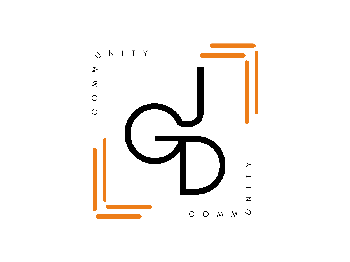
The font choice is Glacial Indifference, designed by Hanken Design Co. It is free for commercial use. The foreground of this design is the letter 'JGD' where the three letters are connected together to show the objective of connecting with peers among graphic designers.
The word community is arranged on the frame of the design, it aims to show that junior graphic designers [JGD] are in a safe place where they can exchange their insights and improve themselves.
The thick rounded-edge lines can build the feeling of continuous communication, orange colour that is applied here can convey a message of positivity and makes the audience excited about the community that we are having here.
The overall lettermark design has implied a more simple design to keep the logo clean and a more remarkable look.
Description
This lettermark logo design has used the rounded corner square shape to keep the logo in place.
The font choice is Glacial Indifference, designed by Hanken Design Co. It is free for commercial use. The foreground of this design is the letter 'JGD' where the three letters are connected together to show the objective of connecting with peers among graphic designers.
The word community is arranged on the frame of the design, it aims to show that junior graphic designers [JGD] are in a safe place where they can exchange their insights and improve themselves.
The thick rounded-edge lines can build the feeling of continuous communication, orange colour that is applied here can convey a message of positivity and makes the audience excited about the community that we are having here.
The overall lettermark design has implied a more simple design to keep the logo clean and a more remarkable look.
Comments (0)
No more comments found
No more comments found