Thumbtech's Design #2

Description

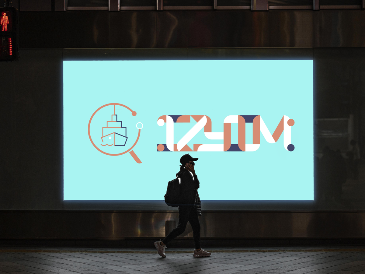
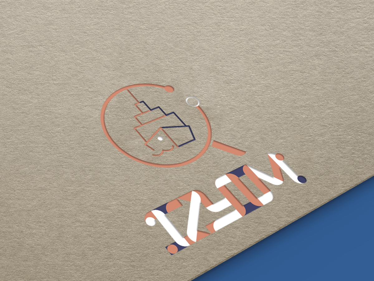
As a sea shipping digitalize company, Izyim always guiding freight forwarding companies to digitalize their business. In this entry, logo was designed with the shape of magnifier, which represent that all the client can always get through their shipping order clearly. The magnifier shaped also represent Izyim identities on their business, which includes accurate, trustworthy and reliable. Just like magnifier, Izyim always clarify and visualize clients order accordingly.

The elements of root of sequoia also being included in the logo design, the extension of root form a cargo ship shape, which represent that Izyim as a logistic company.

The design of company font also followed the shape of the root of sequoia - which extends and connect with each others. While the color chosen were the main color given and purple as secondary color.

Comments (0)

No more comments found

No more comments found