Thumbtech's Design #3
Description
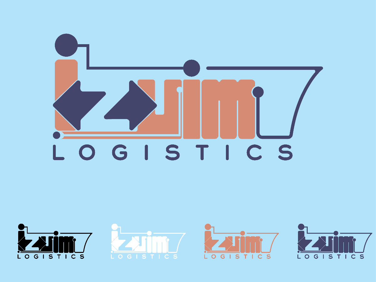
As Izyim was a company that focused on freight forwarder that focused on sea shipping. The line of Izyim logo was presented in the cargo ship. The arrangements of line outline the cargo ship as the main part of the logo. Besides that, the lines also connected with circle dots, which represents connection boarders from Izyim and other company.
Besides that, the design of alphabet [Z] were a combination of two arrows, which also represents main services provided by Izyim, which is the connection betwen Imports and Exports side.
The root of sequoia was applied below the alphabet [Y], the simple and straight forward design of root can stabilize the form of logo, while did'nt shows abrupt towards audience first expressions.
No more comments found
No more comments found
