Curvy Design #3

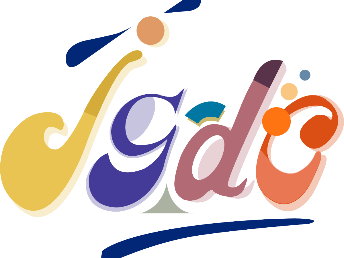
Description
- The lower font case refers to the junior level of graphic design in this design. The words tend to be fairly thin and delicate, the bold words make them appear large on the page.
- The contrast of bright and muted hues creates consistency and a welcoming feeling. While the variety and composition of colors and shapes reflect the diversity of the design platform. The colors were chosen primarily to evoke energy.
- The youthful design is lively and generates a flow, giving this attractive curving form a feeling of incredible comfort. Something remarkable draws attention to itself, attempting to teach people about this visual language through the use of a common pattern. While selecting the visual aspects in detail is simple and fun.
Comments (0)
No more comments found
No more comments found