Tk's Design #2
Description
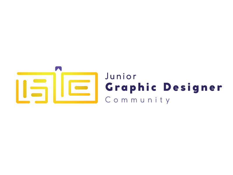
The logo is inspired by maze. Elements of letter J G D C is applied in the maze design, which represents Junior Graphic Designer Community. The other lines which colored in a slightly different tone is used to distinguish among the letters, while also metaphor we are just unique compare to other people. The top has a handle designed to make the whole maze look like a briefcase, partially symbolize professionalism which an aspect a designer need, while inside has an negative spaced arrow, symbolize we manage to get through the hard way and achieve what we want, which the maze represents about, in terms of our values, our hard works and even salary. The yellow section near towards the exit/arrow suggest that we manage to succeed and the future is bright among young graphic designers.
Description
The logo is inspired by maze. Elements of letter J G D C is applied in the maze design, which represents Junior Graphic Designer Community. The other lines which colored in a slightly different tone is used to distinguish among the letters, while also metaphor we are just unique compare to other people. The top has a handle designed to make the whole maze look like a briefcase, partially symbolize professionalism which an aspect a designer need, while inside has an negative spaced arrow, symbolize we manage to get through the hard way and achieve what we want, which the maze represents about, in terms of our values, our hard works and even salary. The yellow section near towards the exit/arrow suggest that we manage to succeed and the future is bright among young graphic designers.
Comments (0)
No more comments found
No more comments found