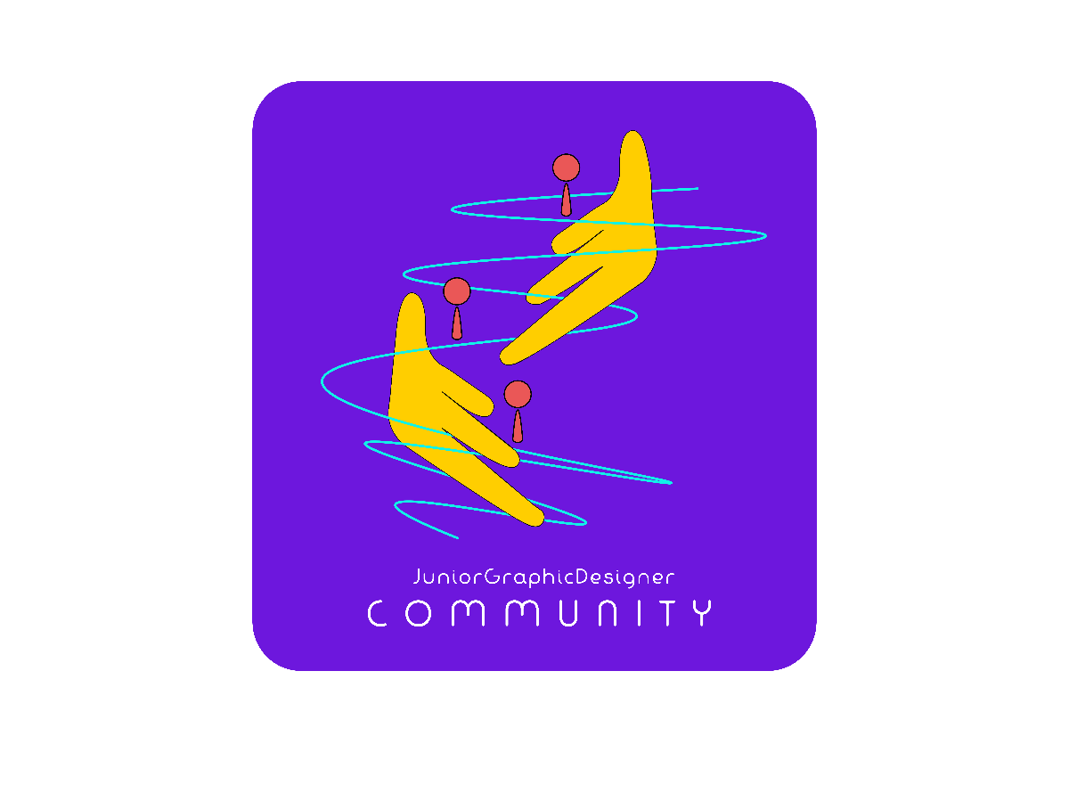
Diana's Combination Mark Logo Design #2
Description
The elements used in this logo are human figures, lines and hands.
Human figures - with the help of JGDC, junior graphic designers can connect with peers.
Lines - curvey lines here act as different ideas that are going on in designers' brains that connect them as well as exchanging ideas & insights among themselves.
Hands - created to resemble stairs to bring out the objective of improving personal capabilities & soft skills as the human figures are climbing higher and higher of the 'stairs'.
Colour used in the elements:
- Cyan blue for the lines, to represent the energy and liveliness of the ideas
- Red for the human figures, to represent the passion of every graphic designer
- Yellow-orange for the hands to make it look more like a real-life hand
My font used is Fabada, designed by deFharo, it's free for commercial use. It has a more curvy appearance that brings out the feeling that designs can be thoughts that are out of the box, creativity should be without any restrictions.
No more comments found
No more comments found
