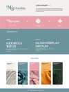
Branding: Ms. Dumbo Beauty
Description
The concept of this rebranding is to give Ms.Dumbo Beauty a more retro and feminine characteristic. I chose to use a more curved typeface for our logo and pale colours to emphasize femininity as it is softer and smoother. The logo combines the symbol of the Korean flower and the diamond shape within the flower to symbolize skincare. The overall mood of the brand revolves around our brand identity, with is to be delightful and feminity.
Please login to post comment
Login
No more comments found
No more comments found
