Elton's Design #1
Description
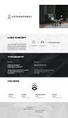
For the concept of this rebranding project, since they accepting two different type of project, so I create an icon for them to let them be easier to recognize. The Supernormal icon have upper section and bottom section, the upper section is representing the commercial project while the bottom section is for the residential project. The upper section is form by the word 'S' while the bottom is form by word 'N'. To let the bottom part look more housing feel, I apply a house icon as a negative space inside the 'N' words. I choose to use the gray colour monochrome because Supernormal is more focusing on minimalism design, also they will apply lot of gray texture into their design. The upper part is in the lighter gray tone because of the higher the building are, they receive more light, this is to represent those building as the commercial project.
Please login to post comment
Login
No more comments found
No more comments found
